


Typography is more than just the art of arranging type—it is a reflection of human history, cultural transformations, and technological innovation. It has always balanced the tactile with the mechanical, the organic with the geometric. What began as bodily gestures transformed into crafted symbols and, later, into manufactured forms designed for infinite repetition.
The evolution of typography traces humanity's relentless quest to communicate more efficiently, beautifully, and expressively. From the clay tokens of ancient Mesopotamia to the dynamic digital fonts of the 21st century, every era has left its mark on how we shape and perceive written language.
This isn’t just a tale of iconic typefaces; it’s about the unexpected moments and breakthroughs that shaped how we express today. These are the stories that make you think, "That event changed everything."
So, let’s embark on this fascinating journey—from ancient symbols to alphabets, handwritten scripts, the printing press, and the boundless possibilities of digital typography. It’s a journey where every letter holds a story.
And it all begins, not with letters, but with symbols.
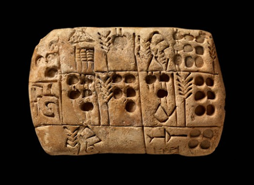
In the ancient lands of Mesopotamia around 8500 BC, as nomadic tribes settled into agricultural communities, a groundbreaking system of record-keeping took shape. The early Sumerians devised a clever method using small clay tokens to represent commodities like grain and livestock. To prevent tampering, these tokens were sealed inside hollow clay balls called bullae, marked with unique seals. As economies grew more complex, physical tokens became cumbersome, giving way to symbols inscribed on clay tablets—an early step toward written communication.
By 3000 BC, Egyptians developed hieroglyphics—an elaborate system blending pictographic and alphabetic elements. Unlike Mesopotamian tokens, hieroglyphics could express abstract ideas and record historical events, reflecting a profound cultural shift. Writing was no longer just a tool for counting goods; it became a way to preserve history, religion, and identity.

The shift from memory-based systems to physical record-keeping marked humanity's first step toward written communication. The real innovation wasn’t just the systems themselves but the drive to simplify complex processes. Each advancement—from tokens to symbols to alphabets—reflected humanity’s relentless desire to make communication more efficient, meaningful, and accessible.
Egyptian hieroglyphs laid the groundwork for the Phoenician alphabet, the first widely adopted phonetic writing system. Around 1200 BC, the Phoenicians, as seafaring traders, faced the need for a practical and adaptable script. Their Proto-Canaanite alphabet, consisting of just 22 consonantal signs, marked a revolutionary shift by representing sounds rather than entire words or syllables. This simplification made writing more accessible, facilitating communication across the Mediterranean. The Phoenician innovation paved the way for the Greek alphabet, which later introduced vowels, further enhancing its versatility and phonetic precision.

The story of how our modern alphabet emerged is a fascinating tale of cultural exchange. When the Etruscans encountered Greek settlers and their alphabet, they adapted these characters to their own language. The Romans, in turn, refined the Etruscan system into what we now know as the Latin alphabet. This evolution wasn't just about adding new letters—it was about creating a standardized system that could effectively serve an expanding empire.
Following the fall of the Western Roman Empire, an unexpected group became the guardians of written knowledge: monastic scribes. These dedicated individuals didn't just copy texts; they developed new scripts and standards for consistency and legibility. Their work on materials like copper plates and birch bark wasn't merely preservation—it was an early form of quality control in typography. This led to the creation of the Carolingian minuscule in between the 8th-9th century, under Charlemagne’s reign. The standardized, lowercase script improved readability and paved the way for modern typography.

The evolution of alphabets during this period was driven by the need for functionality, legibility, and the preservation of knowledge. Each innovation reflected a society's efforts to adapt writing for its cultural and administrative needs.
In 15th-century Germany, Johannes Gutenberg's invention of the movable type printing press forever changed the course of history, making knowledge widely accessible through mass production. While the concept of movable type had been pioneered earlier in China by Bi Sheng in 1040 AD, Gutenberg’s innovation proved far more impactful due to Europe's growing demand for books and advancements in metallurgy.
The 42-line Gutenberg Bible, printed in 1455, was a landmark achievement. Gutenberg chose the dense Blackletter (Textura) script to mimic the familiar hand-written style of religious manuscripts, easing societal acceptance of printed books. This breakthrough wasn't just technological—it was psychological, legitimizing mechanically reproduced texts in a conservative society that revered hand-copied works.

In 15th century Italy, humanist writers and scholars rejected Gothic scripts for the letter antica, a classical mode of handwriting with wide and more open forms. The preference for lettera antica was a part of Renaissance (rebirth) of classical art and literature. The heavy, angular Blackletter type was soon eclipsed by cleaner, more readable Roman typeface - Jenson, pioneered by Nicholas Jenson in Venice in 1470. Jenson's elegant designs blended Gothic traditions with Italian rounder forms, prioritizing clarity and marking a shift toward type designed for print rather than handwriting. His type was so celebrated that contemporary advertisements claimed it "does not hinder one's eyes, but rather helps them and does them good."

The printing revolution was not just about technological progress—it was a cultural and intellectual upheaval that redefined knowledge. Movable type empowered societies to share ideas on an unprecedented scale, dismantling the gatekeeping of information by the elite and paving the way for the democratization of learning and creativity.
The Renaissance saw a flourishing of type design, driven by a renewed emphasis on aesthetics and functionality. It also brought a revolution in reading habits. As literacy spread and a mobile class of readers emerged, Aldus Manutius in 1501 responded by creating smaller books also known as the “pocket books”. His introduction of Italic type, modeled on a more casual style of handwriting, crafted by Francesco Griffo, allowed more text to fit on each page while remaining legible. For calligraphers, the Italic form was economical because it saved time and alongside it democratized reading by making books more affordable and accessible to a wider audience.

In the 18th century, William Caslon and John Baskerville abandoned the rigid nib of humanism for the fluid, swelling paths of the steel pen and pointed quill.
William Caslon's typefaces like Caslon, introduced in 1725, became so popular that American printers used them to set the Declaration of Independence in 1776. The story behind Caslon's success reveals much about typography's role in nation-building—his types were chosen not just for their legibility but for their ability to convey authority and permanence.

John Baskerville's contributions in 1757 were equally revolutionary, though in a different way. Dissatisfied with existing printing methods, he developed his own ink formulas and paper-smoothing techniques. His obsession with perfection led him to create types like Baskerville that featured high contrast between thick and thin strokes called the “Transitional style.” The transition here was from mere functionality to aesthetic refinement—typography was becoming an art form in its own right.

During the 1780s, Giambattista Bodoni in Italy and Firmin Didot in France carried Baskerville’s severe vocabulary to a new extreme. They brought the shift from “Transitional style” to “Modern style”, having a rational, progressive, and nuanced outlook. Their typefaces had a sharp contrast between thick and thin - leading a gateway to an explosive vision of typography unhinged from calligraphy, epitomizing the Enlightenment’s ideals of reason and clarity.

Typography during the Renaissance and Enlightenment was not just a craft but a cultural force that reshaped how knowledge was created, consumed, and understood. From Aldus Manutius democratizing reading with pocket books and Italic type to John Baskerville elevating typography to an art form, these innovations were driven by the desire to marry aesthetics with purpose. The rise of Modern style typefaces by Bodoni and Didot marked a defiant break from calligraphic traditions, embracing precision and clarity as symbols of reason and progress. Typography became a reflection of human ambition—where design was no longer a tool but a statement of power, intellect, and cultural evolution.
The 19th century marked a dramatic transformation in typography driven by industrialization and the rise of mass advertising. Typography needed to be bold and attention-grabbing to compete in bustling urban environments. Designers responded by enlarging and embellishing classical letterforms to create a type that "shouted" to be seen.
In 1806 Robert Thorne’s Fat Face embodied this era's brashness with extreme contrasts between thick and thin strokes. Similarly, in 1815, Vincent Figgins’ Slab Serif was initially dismissed as "typographic monstrosities," became essential for posters and advertisements, redefining type as a visual statement rather than just a medium for text.

The invention of the first ans-serif typeface called Caslon Egyptian by William Caslon IV in 1816, though initially unpopular, paved the way for modern typography trends. This period saw the evolution of type from a tool for information to a bold medium for commerce and cultural expression.

The Industrial Revolution transformed typography into a powerful commercial tool, with bold, expressive typefaces embodying the dynamism of a rapidly evolving society and redefining type as a visual force for communication.
During the early years of the 20th century, as industrialized cities in Europe and US continued to grow, increasing numbers of people began to feel disillusioned by existing forms of social organization, cultural production, and traditional belief systems. After WWI, this resistance to accepting norms consolidated to several avant-garde artistic, literary and philosophical movements that arose to challenge social institutions and the attitudes they represented.
These initiatives were grouped under “Modernism” although they were very diverse in terms of geography, politics, or concepts, encompassing movements from Art Nouveau to Dadaism and from Art Deco to Futurism. There was a shared objective of intention to divorce themselves from historical forms creating a major impact on commercial art, typography, and printing.
The early 20th century radically redefined typography. The De Stijl group in the Netherlands reduced alphabets to perpendicular elements, while Bauhaus designers Herbert Bayer and Josef Albers built letters from basic geometric forms.
The story of Herbert Bayer's Universal typeface is particularly telling. In 1925 Bayer's Universal typeface challenged tradition by proposing the elimination of uppercase letters, arguing, "The voice does not make capital sounds. Why then should the eye require them?" Herbert Bayer was less concerned with issues of typographic convention and more with total reform of their writing system. His proposal to eliminate them was particularly radical for Germany, in which many capitals are used. This wasn't just about simplification—it was about challenging centuries of typographic tradition.

During a time when traditional typefaces like Fraktur were favored in Germany, Futura represented a break from the past. Paul Renner's creation of Futura in 1927 emerged from similar revolutionary thinking, embodying the obsessions of avant garde in a multipurpose, commercially available typeface. While not directly associated with the Bauhaus, Renner's geometric sans-serif typeface embodied modernist ideals of functionality over decoration. The fact that Futura was later chosen for the plaque left on the moon by Apollo 11 shows how this new typography came to represent progress itself.

In 1928 Morris Fuller Benton's Broadway became a typographic symbol of the Art Deco era in the USA, instantly evoking the glitz and glamour of the Jazz Age. The geometric capitals, bold curves, and vertical lines captured the decorative spirit of the time, symbolizing creativity and resilience during the Great Depression.

The same year Eric Gill’s Gill Sans emerged as Britain’s answer to German geometric typefaces like Futura. Commissioned by Monotype, it quickly became associated with British identity, adopted by organizations like the BBC and the London and North Eastern Railway. Its inspiration came from Edward Johnston’s typeface for the London Underground, emphasizing legibility and versatility.

Victor Lardent and Stanley Morison developed Times New Roman in 1932 as a response to a critical article by Morison about The Times newspaper’s outdated typography. The hybrid design combined old-style and transitional letterforms, balancing legibility with space efficiency, making it a staple for modern newspaper production and a timeless typographic standard.

The modernist era marked a radical departure from historical traditions, revolutionizing typography with a focus on simplicity, functionality, and geometric precision. Influenced by movements like Bauhaus, designers such as Herbert Bayer and Paul Renner rejected ornate styles in favor of clean, sans-serif designs. This transformative period laid the foundation for typefaces that continue to shape visual communication across commercial and cultural landscapes.
After World War II, the recovery of international trade and industry fueled a surge in demand for printed materials, coinciding with advances in type generation technologies. Traditional letterpress printing gave way to modern methods, marking a pivotal shift in visual communication. The International Typographic Style (Swiss Style) emerged, emphasizing clarity, grids, and sans-serif typefaces like Helvetica. This design philosophy reflected a post-war desire for order and neutrality. Helvetica, designed by Max Meidinger, became a global symbol of modernism, valued for its versatility and clean, neutral aesthetic.
The development of Helvetica in 1957 by Max Meidinger marks another fascinating chapter in typographic history. Created to compete with Akzidenz Grotesk, Helvetica became much more than just another sans-serif font—it became a symbol of Swiss design principles and corporate modernism. Its success story reveals how typography can embody cultural values; in this case, neutrality, clarity, and rationality.

The mid-century also saw the rise of bold display typefaces, including Geoffrey Lee's Impact in 1965. Known for its thick vertical strokes and high legibility, Impact was initially used for marketing materials before gaining digital fame as part of Microsoft Windows' core fonts. Its adoption in web design and meme culture cemented its place as a symbol of attention-grabbing digital communication.
In 1967, Dutch designer Wim Crouwel responded to the rise of electronic technology with his experimental New Alphabet. Designed entirely from straight lines, the typeface was optimized for display on cathode ray tube (CRT) screens, where curves and angles were difficult to render due to horizontal scan lines. While initially criticized for its lack of readability, the New Alphabet later gained renewed attention, notably appearing on Joy Division's Substance album cover. It has since become a symbol of progressive design, challenging traditional typographic conventions and inspiring future explorations in digital typography.

The mid-20th century revolutionized typography, driven by technological advancements and a post-war desire for order and clarity. The Swiss Style introduced clean, grid-based designs with typefaces like Helvetica, which became a global symbol of modernism. Bold display fonts like Impact responded to marketing needs, while experimental typefaces like Crouwel's New Alphabet pushed boundaries in digital typography, reflecting a forward-thinking approach that continues to influence design today.
The early 1980s saw personal computing revolutionize graphic design, with Adobe's PostScript enabling seamless digital-to-visual output and Apple’s LaserWriter printers advancing desktop publishing. The 1990s became a pivotal era where traditional design conventions were questioned, marking a reaction against outdated visual communication principles.
The introduction of the Macintosh computer by Steve Jobs in 1984 marked the beginning of a new era in typography. Susan Kare's Chicago typeface, designed specifically for the Mac's screen, demonstrated how typography needed to adapt to technological constraints. Robust yet user-friendly, Chicago became integral to the Mac interface from 1984 to 1997. Initially a bitmap font, it later evolved into a vector-based TrueType version, symbolizing Apple's innovative spirit and setting the tone for future user-friendly design.

In 1989, Carol Twombly designed Trajan for Adobe, drawing inspiration from the monumental Roman inscriptions on Trajan's Column. This all-uppercase serif typeface reflected the grandeur and timeless elegance of ancient letterforms. Its classical proportions and formal appearance quickly made it a favorite in movie posters and prestigious branding, symbolizing epic narratives and tradition.

Vincent Connare created Comic Sans in 1994 for Microsoft. Originally intended for the cartoon dog Rowan in the lighthearted interface of Microsoft Bob, its playful comic-book-inspired style found unexpected popularity. Though often criticized for misuse in formal contexts, Comic Sans gained a cult status, becoming a cultural icon appreciated for its accessibility and fun aesthetic. Despite its notoriety, studies highlight its usefulness for children and individuals with dyslexia.

A new generation of designers in the 1990s challenged modernist norms, leveraging emerging technologies to question traditional visual communication principles. Though many designs were short-lived, they marked a pivotal reaction against rigid, hegemonic, and outdated conventions. These innovations, driven by technological advancements and creative experimentation, continue to influence digital typography today.
The digital revolution of the late 20th century shattered traditional design norms, unleashing a wave of creative freedom that redefined typography. With game-changing typefaces like Chicago, Trajan, and even the divisive Comic Sans, designers broke free from rigid conventions, proving that technology isn't just a tool—it's a catalyst for innovation. The era wasn't just about fonts; it was about challenging the status quo and shaping the future of visual communication.
Today's typography continues to evolve with technology. The development of web fonts and variable fonts represents not just technical innovation but a fundamental shift in how we think about type. These new technologies allow typefaces to adapt dynamically to different devices and contexts—a level of flexibility that would have been unimaginable to earlier typographers.
In the 21st century, typography continues to evolve with advancements in web design and variable fonts, offering unparalleled flexibility and responsiveness. Typefaces like Gotham, whose distinctive yet utilitarian style became the signature typeface used in Barack Obama’s 2008 campaign, highlight the enduring power of typography to convey identity and emotion.

Graphic designers select typefaces by considering their historical origins, current associations, and visual characteristics. The aim is to align the letterforms with the project's unique social context and content requirements. There are no rigid rules dictating a fixed meaning or purpose for every typeface. Contemporary typography exists at the crossroads of technology, culture, and design, influencing communication across everything from political campaigns to personal devices.
Typography is a reflection of humanity, blending tradition and rebellion through every letter and curve. Typography is both a tool for communication and a canvas for shaping identity, meaning, and how we see the world.
Throughout history, typography has mirrored the human condition. The Renaissance pursued beauty and logic in type, while Modernism rejected ornamentation for functional clarity. The post-war era embraced the orderly grids of Swiss design, yearning for structure in a fractured world. In contrast, the digital revolution's experimental typefaces champion complexity and impermanence, celebrating freedom and creativity.
Even now, AI-generated type and dynamic fonts continue to challenge the balance between human creativity and technological automation. However, this progress comes with a warning: as technology advances, we risk losing the tactile, human connection that has defined typography for millennia. The clay tokens of Mesopotamia, the handcrafted Blackletter of Gutenberg’s Bible, and Bodoni’s elegant punch cuts were physical, imperfect, deeply human acts. In contrast, the sterile perfection of digital type threatens to strip typography of its soul, reducing it to a mere algorithmic product. If we are not careful, we may find ourselves in a world where type becomes so invisible and automated that it ceases to inspire or provoke thought.
Typography is a map of where we are headed. If you look closely, every letter, typeface, and innovation tells the same story: the future of typography is the future of human expression.
As technology advances, typography is evolving beyond static communication to offer immersive, dynamic experiences. The question has shifted from how do we read? to how do we experience text? In this age of artificial intelligence and immersive technologies, typography faces a profound challenge: to remain an art as much as it is a science.
Yet, the power to shape its future remains in our hands. We hold the pen—or rather, the font—crafting the narratives of our time. And that is a story worth shaping.
The next chapter of typography's evolution is being written right now.
What story will it tell?


India is sitting on a creative goldmine—centuries-old craftsmanship, textiles packed with stories, and art passed through generations.

When I started working in the creative business, you didn’t have to look hard to find legends.

In 2024, design wasn’t just about looking good—it was about keeping up with what people cared about, how tech advanced, and where culture headed.

344 Corning AVE, Milipitas
California 95035
Baron House, 29, 80 Feet Rd,
S.T. Bed, 4th Block, Koramangala,
Bengaluru, Karnataka 560034


